
In the 6 Key Points To Consider Before Designing Infographics article, we have gone over several points that must be taken into account before creating the infographic in order to reach the best practices and to make sure the infographic is the right choice and form, which ideates with the targeted audience and identifies the objectives behind its design.
But when reaching the implementation stage, there are many points to be perceived and processed to improve the instructional layout of the infographic (content and design wise), including:
1. Choosing An Attractive Title

The title is an important element in addressing the audience and seizing their attention to look at an infographic – whether it’s of interest- or to skip it. Therefore, a short, clear, and attractive title must be chosen to create focus and provide a clear idea of the content.
A subtitle can offer extra explanation and clarification about a certain idea within the infographic.
Example: An infographic that represents the increase in car costs but focuses on the consequence of the decline in sales. The title should be about that, such as : “Rising prices decrease car sales” or “A decline in car sales” with a subtitle like: “Rising car prices cause sales to decrease by XYZ.”
2. Organizing The Information’s Order

Organizing information helps develop the goals of the infographic and improves the layout of the design. This can be done by creating a hierarchy of questions.
Starting with the main idea at the top, then two or three questions will be added underneath the main one, using tools that can help you synthesize your ideas such as “who”, “what” or “where” in a related form to the topic. Then comes the investigative questions that answer the “why”. Following these questions come the answers that form the layout sequence of the infographic in terms of information, which in turn helps in developing the form of the design.
3. Making It Visually Efficient
Several elements can form a visually rich design, ranging from icons, graphics, and images. Icons can be used next to sub-titles or highlighted elements, or create graphics that explain key points, or use images that would support the design idea.
While using images, it is possible to use images without copyright infringement. In the case of having no photographer for the platform, it is advised to choose images with proper lighting, close background colors, or have it all in a unified white coloured background.

4. Using Catchy Graphs
Several geometric shapes can be used to maximize the audience’s understanding of the content of an infographic, including squares, circles, and lines to connect or group information, for example, to attract the visual attention in an infographic from left to right or vice versa, to follow the sequence of information in the infographic.
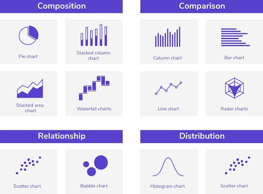
As for graphs, the type of information and data contained in the infographic determines the best graph type to use, amongst the most popular are pie charts, bar graphs, column graphs, and line charts. On the other hand, a column graph is used to compare data, while a line graph is best to measure development and trends over time.
5. Selecting Good Fonts
Choosing a clean, legible font is an important criteria to follow when designing an infographic; decorative fonts are often difficult to read. As for the types of fonts used, it is preferable to stick to two or three types as a maximum, keeping in mind that the optimal use of fonts helps create a dynamic sequence of information.
For example, one font could be used for the main title, let it be the largest, most attractive, and decorative font, as long as it is still legible, another could be picked for the sub-titles of different sections, minding it be smaller than the heading font; and a third line for details under sub-titles, that is significantly smaller, simplified as can be, and easy to read.

6. Using Colors Effectively
Color is a very important element that should not be ignored in an infographic. It is best to be based on the colors of the “logo” of the brand or platform, preferably a choice of two colors, not more, while avoiding the overuse of dark colors that can cause eye strain.
In addition to the visual aspect, colors are used to draw the reader’s attention to certain information by contrasting elements in the infographic, attaching a group of related texts to each other, or using a different color for a certain partial background in the infographic to make it stand out.